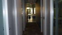
“Commercial Office”
With more attention paid now on greater employee productivity, commercial office spaces are now looking for ideas from designers on how they can better achieve this. Although it doesn’t always have to be brought about from an extensive office renovation. Even a newly renovated office could still benefit from a little more design direction. In this particular case after meeting with and listening to different employees comments of this IT based company (based out of Richmond, BC), it was evident that there was still something missing. Sometimes designing an office space can be more than just about it’s layout. Design can provoke many things, inspiring us from even the simplest understatements.
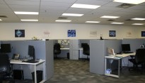
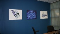
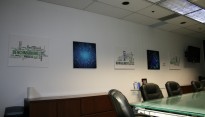
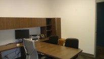
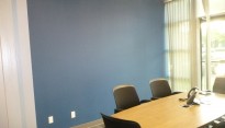
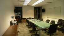
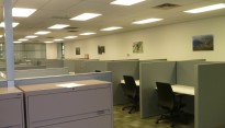
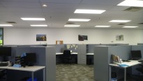
For many employees being productive and having a sense of belonging go hand in hand. Using a few simple design techniques changed the overall feel of this office. By changing out unconnected artwork hung along the length of the Sales Floor wall for industry related reprographic canvas prints, this alone gave an immediate improvement to the open sales floor. Close-up Images and Word Cloud collages easily recognized by staff, now more specific and inspiring to this west coast branch. Similar canvas prints hung throughout the Boardrooms and Management offices, along with the Front Lobby Hallway created the needed overall office cohesiveness.
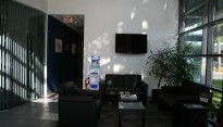
De-cluttering a lobby entrance and waiting area, installing a wall mounted TV (playing corporate branding video) now grounded and balanced the over height wall with the lobby furniture. Allowing greater impact for visiting customers or vendors.
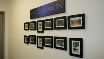
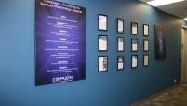
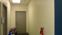
Adding personal touches for the employees in an office might not always be received well by the customers or employers. A challenge when productivity is said to be related to a “sense of belonging”. However, a large canvas with the Corporate Vision, along with document frames for Customer and Vendor Case Studies hung along a feature wall achieved this with everyone in mind. An empty wall near the staff room and washrooms was turned into a tasteful tribute wall. A slogan “We are all Compugen” accompanied with photo framed pictures of events that staff (& their families), management, and even vendors attended and enjoyed together. Pictures and memories of where the company and it’s employees have grown from, with plenty of wall space for future pictures and the growth to come.
Always an awarding project when you get to here from the employees themselves that the work you did made such a difference. A sterile working environment transformed, giving an office not only a sense of direction but personalizing it the same time, it was my pleasure indeed.

